Historically, machine vision inspections have relied on the use of white light. This is primarily because it was readily available from incandescent or fluorescent sources. Certainly, broad spectrum white light is necessary for color vision inspection applications, as well as other inspections that require a specific white color temperature, calibrated in degrees Kelvin. However, there are applications that get better results using monochrome colors, particularly when maximizing the contrast of an object or surface against its immediate background.
A color wheel (Fig. 1) is a simple, yet effective tool for understanding the relationship between colors, and how to apply them to enhance or suppress contrast. In this diagram, the “warm” color family is represented by the colors red, orange, and yellow, whereas the “cool” color family is represented by green, blue, and violet.
It is important to remember two rules of thumb: 1) like colors (or color family) brighten, and 2) opposite colors darken.
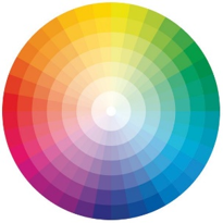
Figure 1
Color Wheel
Color Application Example: The Printing Industry
A common application using color to enhance contrast is found in the printing industry. In the following example, we are inspecting an ink-based postal stamp or cancelling mark. Most often these stampings are red or orange. By applying various colors, we can gauge how effective each color is in enhancing the contrast of the red print against the white paper background.

Figure 2A
Postal Stamp with Red (660nm) Light
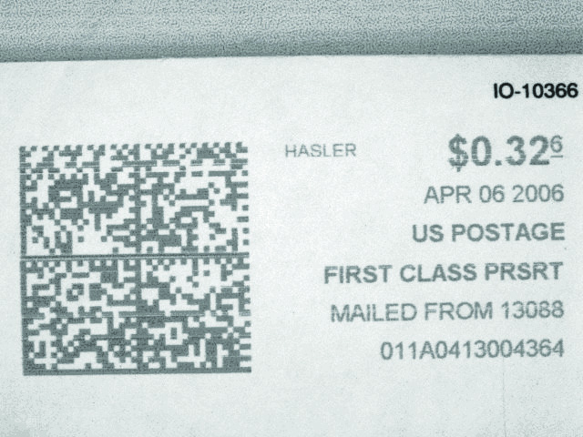
Figure 2B
Postal Stamp with Blue (470nm) Light
Figure 2C
Postal Stamp with Green (530nm) Light
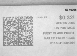
Figure 2D
Postal Stamp with White Light
Illuminating with Red Light
As expected, illuminating with a standard red LED light (See Fig. 2A) results in the postal stamp effectively disappearing. This is because the red light brightens the red print, thus eliminating the contrast between the print and its immediate background.
Illuminating with Blue Light
Based on our understanding of the color wheel, we might then consider illuminating with an opposing, or “cool” color. Using blue light (Fig. 2B), we see there is sufficient contrast, but can we do better?
Illuminating with Green Light
Typically, the strongest response between a sample and the lighting used in the inspection application is achieved when their respective colors appear directly opposed on the color wheel. In this case, green would be a logical choice to produce the most pronounced contrast, as evidenced by the image in Fig. 2C.
Illuminating with White Light
Of course, white light is also an option, but how effective would we expect this broad spectrum light to be, considering it comprises both warm and cool family colors? As expected, the contrast of the white light on the red stamp creates less contrast when compared to the green response (See Figs. 2D vs. 2C).
Choosing A Single Light to Inspect Multiple Colors
A monochrome LED light source works well in the previous simple application, but how do we illuminate the stamps if they are different colors?
The simplest solution is to use white light, noting that it is comprised of both warm and cool family colors. However, we must recognize that image contrast – and thus inspection robustness – will be somewhat compromised in favor of flexibility.
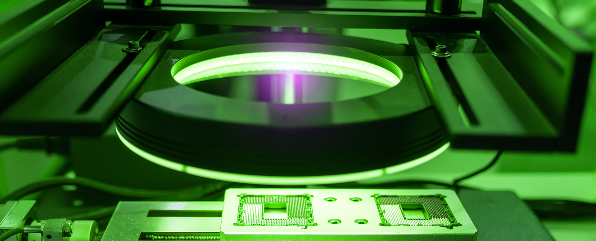
Another possible solution is to use a multi-color RGB light, such as the RL4260-RGB (Fig. 3). Multi-wavelength RGB lights facilitate optimal contrast, often in near real-time, allowing for greater illumination control and increased inspection robustness.
Finally, the use of monochrome light also confers the advantage of being able to use a wavelength-matched band pass filter (See Fig. 4). Using filters in this application is very effective in blocking ambient light, which can adversely affect inspection results.
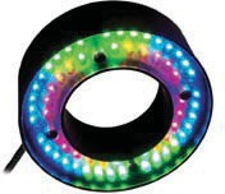
Figure 3
RL4260-RGB
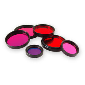
Figure 4
Filters
Final Considerations for Color Inspection
In conclusion, it’s important to consider color when specifying lighting for a machine vision application – both the color of the subject, and the color of the lighting – and how each may affect object-to-background contrast. Remembering the rules of thumb on how to brighten or darken colors will improve your inspection results and return robust, successful images.
Do you have an inspection application requiring maximum image contrast, but you’re not sure how to proceed? Reach out to one of our technical experts, and we’d be happy to help you find a solution!
